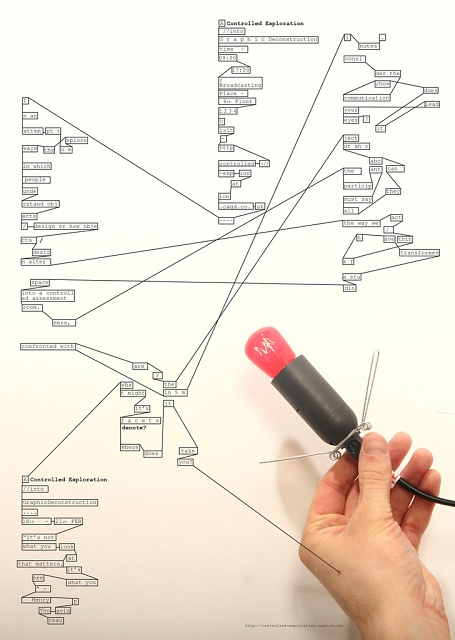
A Controlled Exploration into: Poster
I used Courier New as it resembled the font of a computer code, at the time I was unaware of Consolas. Another reason for my use of this typeface, was that I had in mind the design for the next project; Interjection of Verbal Deconstruction. I wanted to use a font that would feature in the content of the next poster; therefore creating a visual transition between my projects that wasnâ??t too overt and would display a vague resemblance, implying a relationship between them. To contain my text I used boxes like those used on the poster for the previous project, once again implying a relationship.
The layout of the text was largely inspired by something I had found online that looked like a computer code. I liked the way the text was laid out, and I found it reminiscent of New Wave typographic arrangement. I appropriated this characteristic as the basis for the text layout of my poster.
To illustrate my intention of deconstructing conventions within the project, I utilised the Deconstructionist technique of â??fracturingâ?? readability. Through the application of a few rules a new method of reading is created. What initially appears ambiguous becomes coherent with study, or the maintained attention of a spectator.
However, since the function of a poster is to efficiently and effectively present information as quickly as possible, my design was at risk of not serving its purpose. I decided that within the context of the university the risk wouldnâ??t be too great. Alternatively, it would function with a dual purpose of representing the plight of Deconstructionist design in providing coherent understanding.
Similar to that of the Constructivists, the use of linear dynamism and the spatial relationship between text and photography create something aesthetically striking. The lack of typographic hierarchy and the unconventional use of small (body-copy) scale type were used with the intention to maintain attention through the recognition of their unorthodox implementation.
